In this article we will discuss about creating Gauge or Progress bar in iOS Application by using Gauge(
1. Making Horizontal progressBar
2. Creating Circular progressBar
1. Making Horizontal progressBar
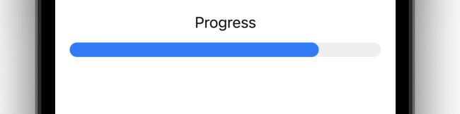
We will create a simple progress bar where currentProgress shows fraction completion of the bar
struct ContentView: View {
    @State private var currentProgress = 0.8
    var body: some View {
        Gauge(value: currentProgress) {
            Text("Progress")
        }
        .padding()
    }
}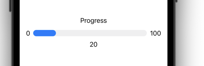
For adding min max values use currentValueLabel minimumValueLabel maximumValueLabel
struct ContentView: View {
    @State private var currentProgress = 20.0
    private let startValue = 0.0
    private let endValue = 100.0
    var body: some View {
        Gauge(value: currentProgress, in: startValue...endValue) {
            Text("Progress")
        }
    currentValueLabel: {
        Text(currentProgress.formatted())
    } minimumValueLabel: {
        Text(startValue.formatted())
    } maximumValueLabel: {
        Text(endValue.formatted())
    }
    .padding()
    }
}
2. Creating Circular progressBar
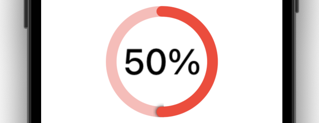
Use .gaugeStyle(.accessoryCircularCapacity) & Optionally you can use .scaleEffect(3) to increase the circle.
struct ContentView: View {
    @State private var currentProgress = 0.5
    var body: some View {
        Gauge(value: currentProgress) {
            //Text("Downloading..")
        } currentValueLabel: {
            Text(currentProgress.formatted(.percent))
        }
        .gaugeStyle(.accessoryCircularCapacity)
        .tint(.red)
        .scaleEffect(3)// Optional for Extra size of Gauge
        .padding()
    }
}
Reference – https://developer.apple.com/documentation/swiftui/gauge