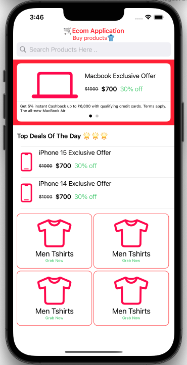
In this tutorial we will create a mini SwiftUI App with complex interference. We will cover following modules by creating mini E-commerce SwiftUI Application, Here all SFSymbol icons are used so It’s lightweight and no external image dependencies 🙂
- A NavigationBar in SwiftUI with custom title colour
- SearchBar in swiftUI
- Pager in SwiftUI with page-control buttons
- Fix height list in swiftUI
- Grid in SwiftUI with customisation
Let’s jump to the code –
1. Create SearchBar in SwiftUI –
- Use
TextFieldwith.overlay(of search icon - We have used
HStackhere because SearchTextField Cross icon and Cancel button all are aligned horizontally isEditingModeis used to know weather to searchBar is Active ? if so show up cancel button.- This is UI Only code as in this article we are focusing on building UI with many components.
A precise code would be –>
import SwiftUI

struct SearchBarView: View {

    @State private var isEditingMode = false
    @Binding var currentSearchText: String

    var body: some View {
        HStack {

            TextField("Search Products Here ..", text: $currentSearchText)
                .padding(8)
                .padding(.horizontal, 26)
                .background(Color(.systemGray6))
                .cornerRadius(8)
                .overlay(
                    HStack {
                        Image(systemName: "magnifyingglass")
                            .foregroundColor(.gray)
                            .frame(minWidth: 0, maxWidth: .infinity, alignment: .leading)
                            .padding(.leading, 7)

                        if isEditingMode {
                            Button(action: {
                                self.currentSearchText = ""
                            }) {
                                Image(systemName: "multiply.circle.fill")
                                    .foregroundColor(.gray)
                                    .padding(.trailing, 7)
                            }
                        }
                    }
                )
                .padding(.horizontal, 9)
                .onTapGesture {
                    self.isEditingMode = true
                }

            if isEditingMode {
                Button(action: {
                    self.isEditingMode = false
                    self.currentSearchText = ""

                }) {
                    Text("Cancel")
                }
                .padding(.trailing, 9)
                .animation(.easeOut)
            }
        }
    }
}

struct SearchBarView_Previews: PreviewProvider {
    static var previews: some View {
        SearchBarView(currentSearchText: .constant(""))

    }
}
2. Creating Pager in SwiftUI
TabViewis used to create pager in SwiftUI clip shape for customisationclipShape(RoundedRectangle(cornerRadius: 10.0, style: .continuous))setupAppearanceForPager()is used for changing colour of the Pager dots which invokes on.onAppearmethod- Select
TabViewStyle.tabViewStyle(PageTabViewStyle())this settings is for pager
code for pager —>
import SwiftUI

struct PageView: View {
    var body: some View {
        TabView {
            ForEach(0..<2) { i in
                ZStack {
                    Color.white
                    VStack {
                        HStack() {
                            Image(systemName: "laptopcomputer")
                                .resizable()
                                .aspectRatio(contentMode: .fit)
                                .frame(height: 70)
                                .foregroundColor(.pink)
                            VStack(alignment: .leading, spacing: 0) {
                                // Spacer()
                                Text("Macbook Exclusive Offer")
                                    .padding(.leading,10)
                                    .foregroundColor(.black)
                                HStack{
                                    Text("$1000")
                                        .strikethrough(true, color: .black)
                                        .padding(.leading,10).font(.caption)
                                    Text ("$700")
                                        .font(Font.headline.weight(.semibold))
                                    Text ("30% off")
                                        .font(Font.body.weight(.light))
                                        .foregroundColor(.green)

                                }
                                .foregroundColor(.black)
                                //Spacer()
                                .frame(height: 50)
                            }
                        }
                        Divider()
                        Text("Get 5% instant Cashback up to ₹6,000 with qualifying credit cards. Terms apply. The all-new MacBook Air")
                            .font(.system(size: 10))
                    }

                }
                .clipShape(RoundedRectangle(cornerRadius: 10.0, style: .continuous))
            }
            .padding([.all], 10)
        }
        .frame(maxHeight: .infinity)
        .frame(width: UIScreen.main.bounds.width)
        .tabViewStyle(PageTabViewStyle())
        .background(Color.red)
        .onAppear {
            setupAppearanceForPager()
        }
    }

    func setupAppearanceForPager() {
        UIPageControl.appearance().currentPageIndicatorTintColor = .black
        UIPageControl.appearance().pageIndicatorTintColor = UIColor.black.withAlphaComponent(0.2)
    }
}

struct PageView_Previews: PreviewProvider {
    static var previews: some View {
        PageView()
    }
}
3. Creating Custom List in SwiftUI
- Create
DeviceEntitymodel for dataSet of List or TableView - Since we have items in horizontally use List with
HStack .listStyle(.plain)used for remove padding from the List rows- To setup image in list with custom height
resizableused withaspectRatioto.fit strikethroughused to make a Old & New price label
Code for ListView –>
import SwiftUI

struct DeviceEntity:Identifiable {
    let id = UUID()
    var name: String
}
struct ProductListView: View {

    @State var deviceList:[DeviceEntity] = [DeviceEntity(name: "iPhone 15 Exclusive Offer"),
                                            DeviceEntity(name: "iPhone 14 Exclusive Offer")]


    var body: some View {
        List(deviceList) { currentObject in
            HStack {
                Image(systemName: "iphone")
                    .resizable()
                    .aspectRatio(contentMode: .fit)
                    .frame(height: 50, alignment: .center)
                    .foregroundColor(.pink)

                VStack(alignment: .leading, spacing: 0) {
                    // Spacer()
                    Text(currentObject.name)
                        .padding(.leading,10)
                    HStack{
                        Text("$1000")
                            .strikethrough(true, color: .black)
                            .padding(.leading,10).font(.caption)
                        Text ("$700")
                            .font(Font.headline.weight(.semibold))
                        Text ("30% off")
                            .font(Font.body.weight(.light))
                            .foregroundColor(.green)

                    }
                    //Spacer()
                    .frame(height: 50)
                }//.environment(\.defaultMinListRowHeight, 100)
            }
        }
        .listStyle(.plain)
        .frame(height:170)
    }
}

struct ProductListView_Previews: PreviewProvider {
    static var previews: some View {
        ProductListView()
    }
}
4. Create Custom Grid in SwiftUI
- Here we are creating Grid or collectionview in swiftUI by using
LazyHGrid itemsRangeForGriddefines how many item required for the Grid, in our current example we are creating Grid of 4 itemsGridItemfor item configuration- As in our example we have set of two items vertically we will be using
VStack& add Images & Text there .overlay( is used to create BorderRadius with colour
import SwiftUI

struct CustomGridLayout: View {
    let itemsRangeForGrid = 1...4
    let gridRows = [
        GridItem(spacing:5),
        GridItem(spacing: 5),
    ]

    let gridItemWidth = (UIScreen.main.bounds.width-30)/2

    var body: some View {
        ScrollView(.horizontal) {

            LazyHGrid(rows: gridRows, alignment: .center,spacing: 5) {

                ForEach(itemsRangeForGrid, id: \.self) { item in

                    ZStack {
                        VStack(alignment: .center, spacing: 5) {
                            Image(systemName: "tshirt")
                                .resizable()
                                .aspectRatio(contentMode: .fit)
                                .frame(height: 75, alignment: .center)
                                .foregroundColor(.pink)

                                Text("Men Tshirts")
                                    .frame(maxWidth: .infinity, alignment: .center)
                                    .font(.system(size: 20))
                                Text("Grab Now")
                                    .frame(maxWidth: .infinity, alignment: .center)
                                    .foregroundColor(.green)
                                    .font(.system(size: 10))

                        }.frame(width: gridItemWidth, height:145, alignment: .center)
                            .overlay(
                                RoundedRectangle(cornerRadius: 10)
                                    .stroke(Color.red, lineWidth: 1)
                            )
                    }
                }
            }
            .frame(height: 300)
        }
        .padding([.leading, .trailing],10)
    }
}

struct GridLayout_Previews: PreviewProvider {
    static var previews: some View {
        CustomGridLayout()
    }
}
5. Dashboard file where we link all SwiftUI View
NavigationViewis used for creating Navigation in SwiftUI & We will Embed all item to ScrollView so that user can scroll over items
Since we have long vertical list we are usingVStack- Use .
toolbarfor setting unavigationBartitle & Text .navigationBarTitleDisplayMode(.inline)For shorternavigationBar
import SwiftUI

struct ContentView: View {

    @State var searchBarText:String = ""

    var body: some View {

        NavigationView {

            ScrollView {
                VStack(alignment: .leading) {
                    SearchBarView(currentSearchText: $searchBarText)

                    LazyHStack {
                        PageView()
                    }
                    .padding([.all], 0)
                    .background(Color.blue)
                    .frame(height:175)

                    Text("Top Deals Of The Day 🌟🌟🌟")
                        .multilineTextAlignment(.leading)
                        .padding(.all, 10)
                        .font(.headline)

                    ProductListView()

                    CustomGridLayout()

                    //Spacer()
                }
                .toolbar {
                    ToolbarItem(placement: .principal) {
                        VStack {
                            Text("🛒Ecom Application").font(.headline)
                            Text("Buy products👕").font(.subheadline)
                        }
                        .foregroundColor(.red)
                    }
                }
            }
            .navigationBarTitleDisplayMode(.inline)
        }

    }
}

struct Dashboard_Previews: PreviewProvider {
    static var previews: some View {
        ContentView()
    }
}
That’s all 🙂
Complete Source code available here